When I play Master League I play as my local town, St. Helens. To make it more fun, I usually make the kits look like the ones the rugby league team wears. Normally I just use the in-game kit creator to add a red chevron (V) to a white shirt and it's pretty basic. You can see some clips from PES 2017 and see last years kit in this YouTube video. This year I decided to have a go at editing a template and importing the kits that way. The thing with rugby league kits is they have a lot of sponsors, and in the template it's hard to figure out where everything corresponds to in-game. Also, both the home and away shirts have quite complex designs: the home shirt has a V on that continues onto the shoulders, which is hard to align on the template, as you'll see I failed to get it right. Also the away kit has four diagonal stripes and getting the position of those correct proved a lot harder than I expected. After a lot of tweaks and adjustments I finally settled on two finished kits. I'll post some comparison screenshots below:
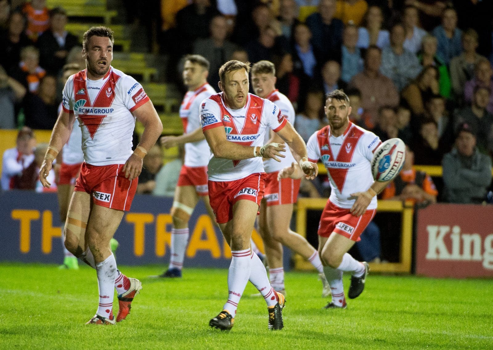
Here's the home kit in real life:
And here's a screenshot of the kit I made:

Things that could be better are as follows:
The chevron doesn't go over the shoulders correctly
The chevron needs to be shorter, which would allow the placement of the sponsor to be correct. (compare the inside tip of the V to the white box for the sponsor, it's lower in real life)
A lot of sponsors are incorrectly placed or missing:
Totally Wicked upper right shoulder
The placement of the St Helens College logo is far too high, more on the shoulders rather than the chest.
(Kingston Press Cider lower left shoulder and Betfred lower right shoulder where purposely left out, so as not to interfere with the league badges that PES adds to kits)
AFEX on the shorts left leg.
There are also two sponsors on the back (Hattons Solicitors at the top, A*Star Recruitment at the bottom, ESRG on the shorts) which can be seen in this photograph.
All sponsors, including logos required can be found on here: https://www.saintsrlfc.com/commercial/sponsors/
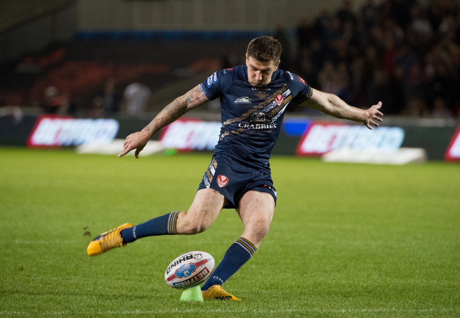
Here is a photo of the away kit in real life:
And here's what I came up with:

I've only just realised the main sponsor is the wrong colour. So that needs to have white text, not black!
The four stripes are very very wrong.
Also some sponsors are missing or incorrect:
Ironically the St Helens College logos are on the chest, but should be on the shoulders. Somehow got them the wrong way around!
Again none of the sponsors on the back are there. They're all the same as the home kit.
Also AFEX logo is missing from the shorts.
For some reason I remembered to put the sponsor on the back of the away socks, but not the home ones, which is really annoying.
For anyone kind enough to take on this request you can see a lot of photographs of both kits by going here and clicking Match Centre on each match, and then Match News and the article with the match report (usually the second one) has lots of photographs at the bottom, like these: Home / Away. Or you can see both kits on the official club store: Home / Away.
And finally here are the two templates I created:


Getting the texture on the away kit was pretty difficult and the result doesn't translate to in game, but I'm not sure how well it comes across in photos anyway. In real life the away kit is like a blue marl effect.
If anyone could take on this request and produce a better looking kit for my Master League team I will be eternally thankful.
Here's the home kit in real life:
And here's a screenshot of the kit I made:
Things that could be better are as follows:
The chevron doesn't go over the shoulders correctly
The chevron needs to be shorter, which would allow the placement of the sponsor to be correct. (compare the inside tip of the V to the white box for the sponsor, it's lower in real life)
A lot of sponsors are incorrectly placed or missing:
Totally Wicked upper right shoulder
The placement of the St Helens College logo is far too high, more on the shoulders rather than the chest.
(Kingston Press Cider lower left shoulder and Betfred lower right shoulder where purposely left out, so as not to interfere with the league badges that PES adds to kits)
AFEX on the shorts left leg.
There are also two sponsors on the back (Hattons Solicitors at the top, A*Star Recruitment at the bottom, ESRG on the shorts) which can be seen in this photograph.
All sponsors, including logos required can be found on here: https://www.saintsrlfc.com/commercial/sponsors/
Here is a photo of the away kit in real life:
And here's what I came up with:
I've only just realised the main sponsor is the wrong colour. So that needs to have white text, not black!
The four stripes are very very wrong.
Also some sponsors are missing or incorrect:
Ironically the St Helens College logos are on the chest, but should be on the shoulders. Somehow got them the wrong way around!
Again none of the sponsors on the back are there. They're all the same as the home kit.
Also AFEX logo is missing from the shorts.
For some reason I remembered to put the sponsor on the back of the away socks, but not the home ones, which is really annoying.
For anyone kind enough to take on this request you can see a lot of photographs of both kits by going here and clicking Match Centre on each match, and then Match News and the article with the match report (usually the second one) has lots of photographs at the bottom, like these: Home / Away. Or you can see both kits on the official club store: Home / Away.
And finally here are the two templates I created:
Getting the texture on the away kit was pretty difficult and the result doesn't translate to in game, but I'm not sure how well it comes across in photos anyway. In real life the away kit is like a blue marl effect.
If anyone could take on this request and produce a better looking kit for my Master League team I will be eternally thankful.